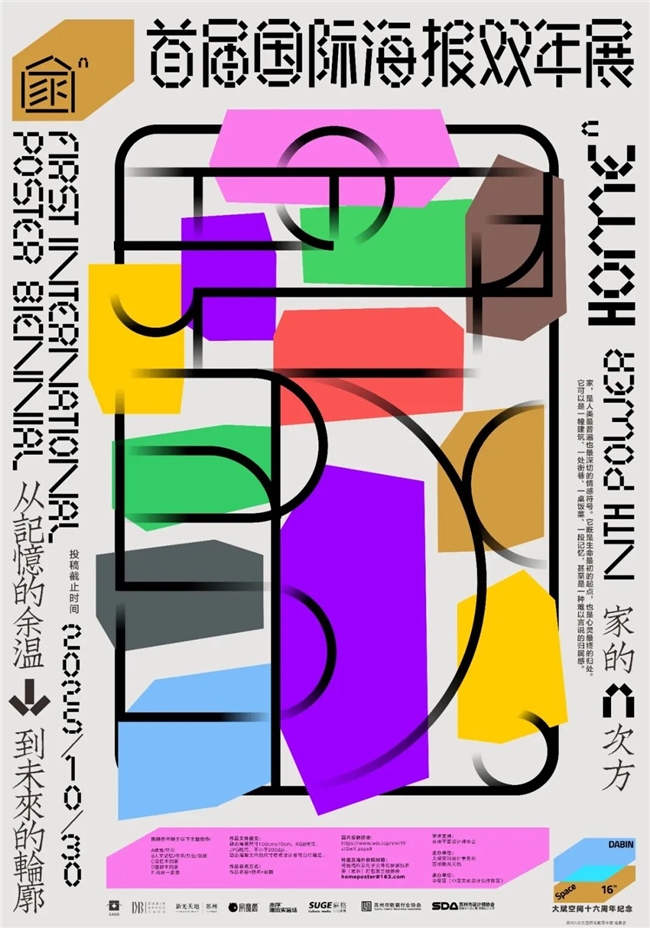
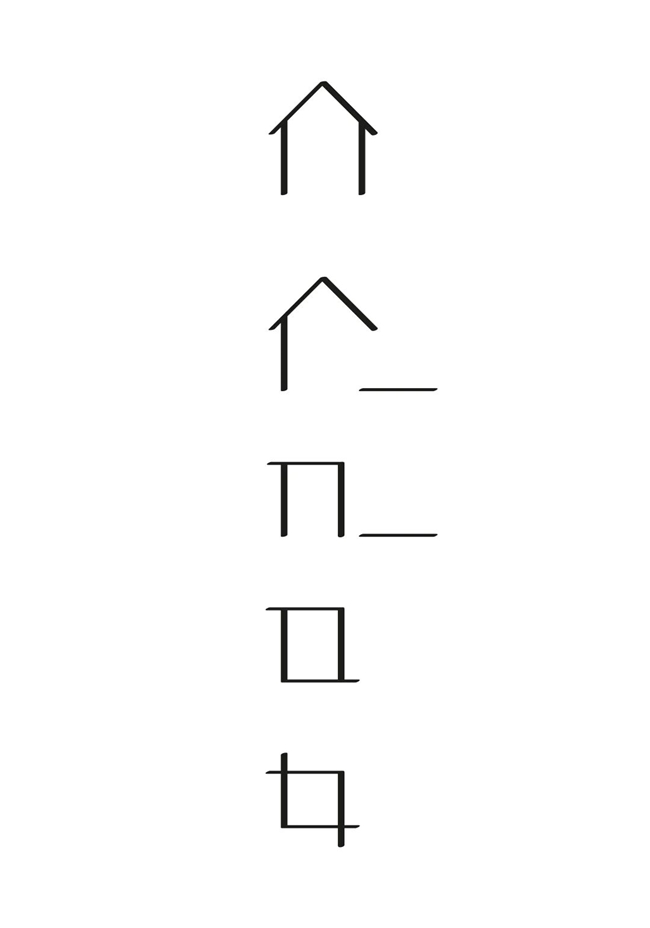
“家”,是人类最普遍也最深切的情感符号。它既是生命最初的起点 ,也是心灵最终的归处。它可以是一幢建筑、一处街巷、一桌饭菜、一段记忆,甚至是一种难以言说的归属感。
在社会不断流动与变迁的今天,家的形态也在发生改变:它既关乎记忆的余温——那些让人热泪盈眶的片段;也关乎未来的轮廓——人们对理想生活的想象与建构。
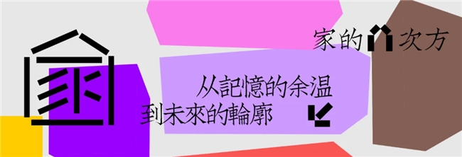
值此大斌空间十六周年之际,我们联合发起 “家的 N 次方”国际海报展,已经邀请全球设计师,以视觉语言为笔墨,从建筑与空间、人文与记忆、共生与创新等维度出发,重新审视和表达“家”的多元意义。
从今日起,我们将陆续推送这些精彩佳作。 这不仅是一场艺术的盛宴,更是大斌空间十六年来对“家”之本质持续探索的深度映照——我们始终相信,设计的力量,在于触碰真实的情感,在于连接人与空间最温暖的共生关系。
特邀作品展示
本期作者:
谢晋业、Buşra İNCİRKUŞ、李宏文、卢妮娜、卢剑飞、朱熙、施又中、王健、Arek Marcinkowski、秦晓楠、楊捷扉、吕鑫、Kye-soo Myung、Emran Abtahi、DR. MAHIMA GUPTA 、宋学军、唐一娇、Takashi Matsuda、Jakub Balicki、Dr. Dhaneshwar Shah、Lula Sarnia、李姚
作品题目: 《家在江南》
创意说明:家在江南
作者简介:谢晋业(苏州)
苏州工艺美院视觉传达学院副院长、副教授、高级工艺美术师、研究生导师,江苏省“333工程”高层次人才,江苏省高校“青蓝工程”优秀青年骨干教师,中国出版协会装帧艺委会委员,苏州平面设计师协会秘书长。
作品题目: 《There is a World Inside》
创意说明:The warm, homely view seen from the window of the white house, a symbol of purity and cleanliness, reflects a colorful world rather than the dark side of the outside world. Every house is a world, and this world is the whole of the house where everyone lives.
作者简介: Buşra İNCİRKUŞ(Türkiye)
Born in Istanbul, the artist completed her undergraduate, graduate, and doctoral degrees at Marmara University. She has participated in national and international symposiums and congresses. She has received national and international awards. She has held numerous group and solo exhibitions. She currently works as an Associate Professor in the Department of Visual Communication Design at Süleyman Demirel University in Isparta, Türkiye.
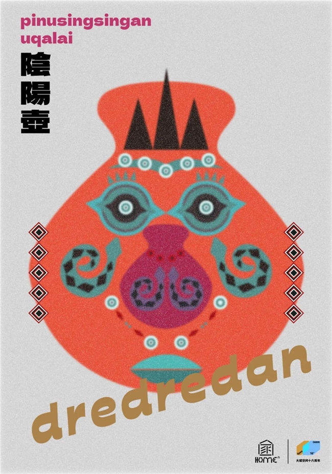
作品题目: 《dredredan》
创意说明:作品以排灣族的重要器物「陰陽壺」為視覺核心,象徵生命與文化的延續,陰陽壺不僅是部落中權力與祝福的象徵,更是一種祖靈與後代之間的連結媒介,承載了族群的信仰、技藝與世代傳承。作品中央的形象結合百步蛇紋樣,象徵守護與靈性的力量,代表祖靈護佑子孫的信念。整體構圖以幾何與對稱的語彙呈現平衡之道,呼應「陰陽共生」的哲理,色彩採用象徵大地與血脈的紅與黑,並融合部落傳統織紋的符號節奏,體現文化在現代語境下的再生與創新,傳達「傳承不是複製,而是延續與再造」的核心精神,讓家的概念在族群文化記憶中持續生長。
作者简介:李宏文(中國台灣)
結合設計思維與企業管理,專長於品牌策略、專案管理與營運發展,長期推動設計產業、文化創意與地方創生,具備嚴謹分析與執行力,能以策略串聯設計、行銷與營運,實現永續價值。
現任 高雄市廣告創意協會理事長,主導品牌定位、國際交流與展覽策劃,推動在地設計與國際接軌,我相信設計不僅是美學,更承載策略、文化與社會責任,持續推動設計驅動的創新,實踐設計為社會創造價值。
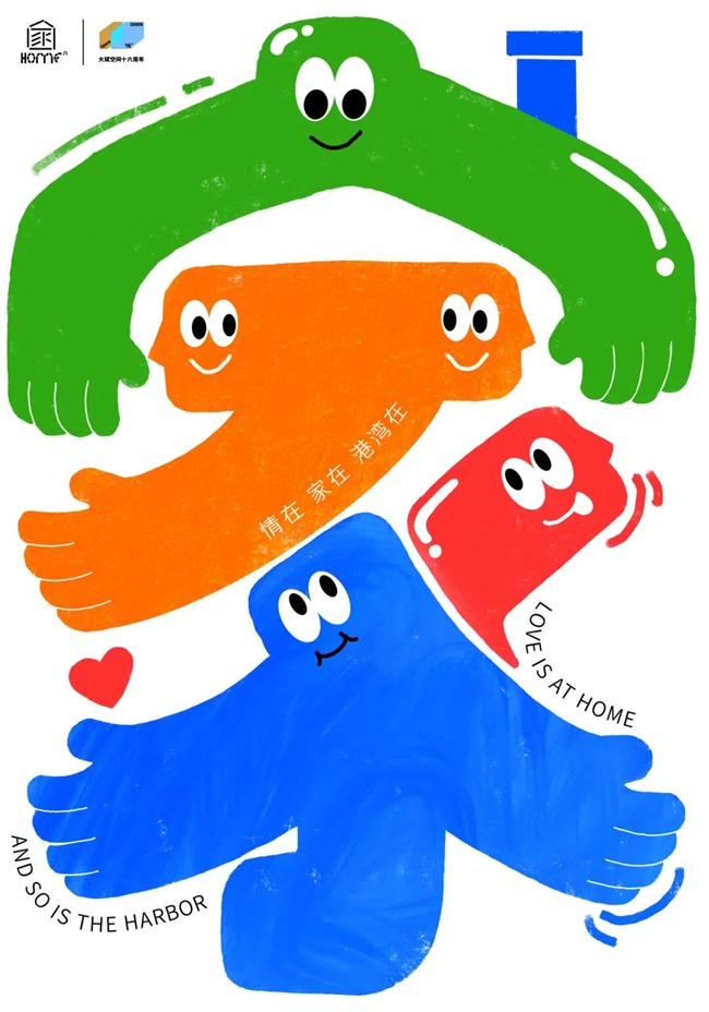
作品题目: 《情在 家在 港湾在》
创意说明:该作品以 “家” 字为视觉核心,通过色彩明快、形态亲和的拟人化图形构建家的意象。通过拥抱的胳膊和拟人化表情组合成“家”字。绿色图形如屋顶般守护,橙色图形似房屋主体承载温暖,蓝色图形如根基传递安稳,红色语音泡则象征家人间的温情对话。各元素以拥抱的姿态交融,搭配爱心符号,生动诠释 “家是情感的港湾,是团聚的暖意,是你我相拥处,情在则家在” 的设计理念,用童趣且富有张力的视觉语言,传递出家的包容、联结与心灵归属。
作者简介: 卢妮娜(上海)
本科毕业于江南大学设计学院。曾在多项设计竞赛中获奖,包括:“米兰设计周中国高校设计学科师生优秀作品展”国家三等奖、未来设计师大赛国家二等奖、中国好创意大赛江苏省一等奖、中国包装创意设计大赛二等奖、白金创意设计大赛优秀奖等。作品曾入选2023中国国际汉字文化创意设计大赛、“光芒”庆祝中华人民共和国成立75周年展览、2025百新—一海报迎新展、第三届“长江•未来”公益海报设计展、神与兽之间:沉浸式中国海洋神话特展等
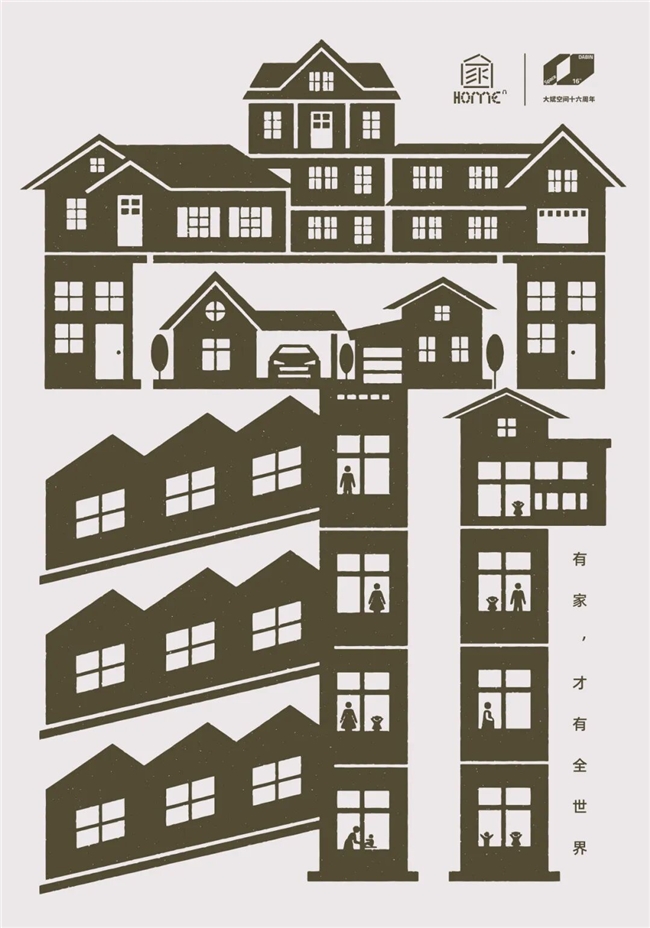
作品题目: 《有家,才有全世界》
创意说明:海报以“家”字为视觉核心,突破性地将文字符号与建筑形态相融合,通过对建筑构件的解构与重组,使“家”超越单纯的字义表达,转化为可触可感的立体空间。设计既保留了“家”作为文化符号的辨识度,又借助现代建筑语言拉近与观众的距离,在温暖情感的自然流露中,引发人们对“家与世界”关系的深层思考。整体视觉语言唤起观者对家的集体记忆与眷恋,让“有家,才有全世界”的价值理念深入人心,实现情感共鸣与观念传达的双重抵达。
作者简介: 卢剑飞(深圳)
奏韵品牌设计创意总监,文化部全国创业创意人才。香港国际艺术协会会员,亚太设计师联盟会员,亚洲中韩设计协会会员,广州平面设计师联盟会员。
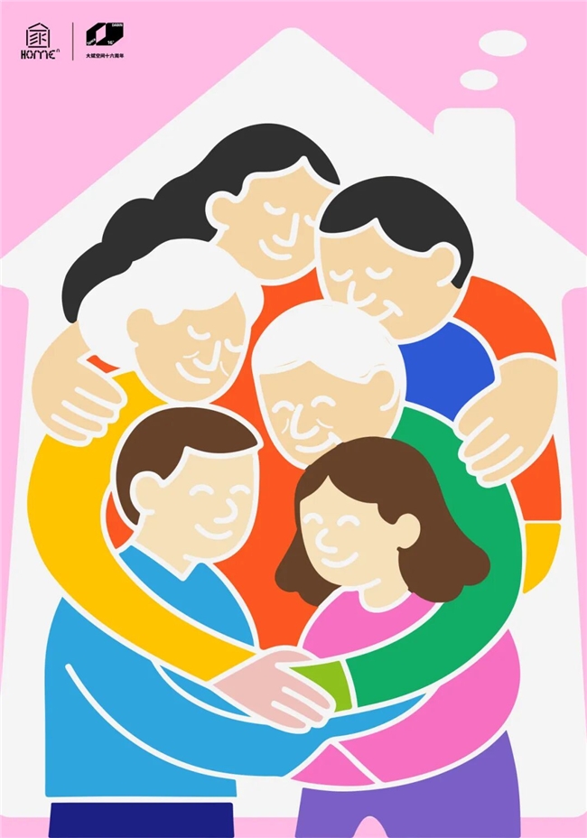
作品题目: 《家的壁垒-家人的爱-爱的聚光灯》
创意说明:家的壁垒-家人的爱”设计说:本作品以多代同堂的家庭成员彼此拥抱为核心意象,构建出一个温暖而坚固的“家”的建筑外形。人物间交织的手臂不仅象征亲情的连接,也构成了家的“壁垒”与庇护所。整体画面以扁平大色块表现温暖、团结与安全,传达出爱是家的最强支撑。
作者简介: 朱熙(成都)
高校老师,艺术教育博士在读,专注视觉传达设计、UI/UX、插画及传统图案设计教学与研究。曾获国际设计奖60余项,作品入选世界五大国际海报展。致力于推动传统文化与数字设计融合,助力跨文化艺术设计交流与传播。
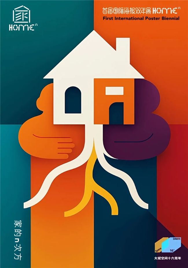
作品题目: 《根系之家》
创意说明:《根系之家》以極簡幾何與飽和色塊構築出「家的隱喻」。畫面中央的白色屋形象徵歸屬的核心,橙與紫的雙臂如擁抱般環繞,傳達出情感的連結與庇護的力量。自屋底延伸出的根系以流動的曲線向下蔓延,暗示家的延續性與生命的滋養,彷彿記憶與愛在土壤中生長。整體構圖以對稱與色彩對比建立平衡,冷暖交錯的區塊象徵家庭中理性與感性並存的溫度。這張海報以視覺語言詮釋「家」不僅是一個居所,更是一種深植於內心的力量——它連結人與人、人與土地、人與時間,提醒觀者:家的根,永遠在心裡延伸。
作者简介: 施又中(中國台灣)
施又中為台灣藝術家,專職藝術創作,以壓克力彩及水彩為主要創作媒材。參加多次台灣聯展及個展並獲獎,作品亦受邀至歐美、南美洲、中東及東南亞等地區展出。
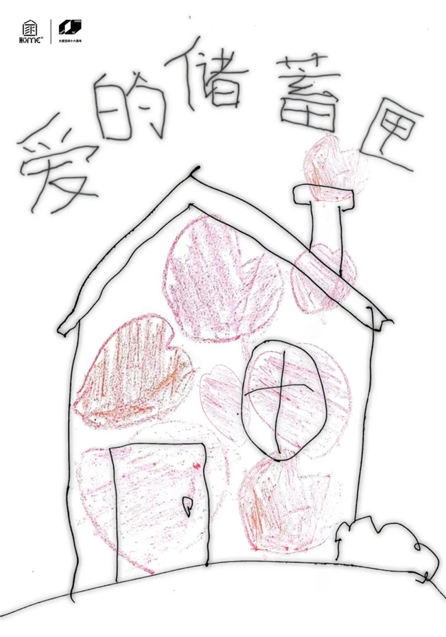
作品题目: 《爱的储蓄匣》
创意说明:以孩童视角解构“家”的情感内核,用手绘的天真感消解“爱”的抽象性,将“家”定义为“爱的储蓄匣”:每一次情感的流动、每一份心意的交付,都在“家”里被妥善储存,最终凝结成支撑生命的温暖力量。
作者简介: 王健(河南)
设计爱好者
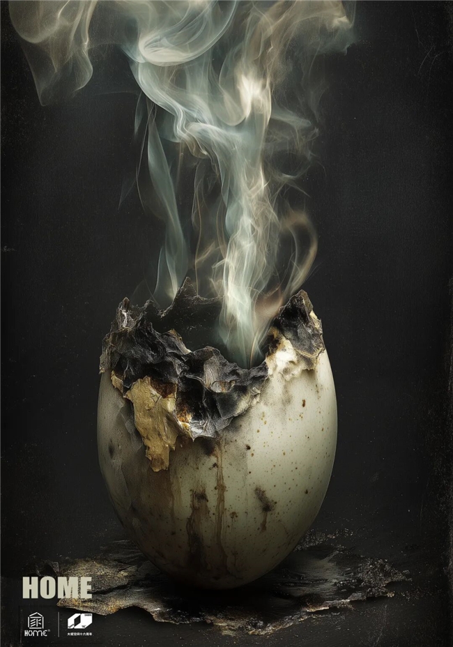
作品题目: 《HOME》
创意说明:Category: Architecture / Space /Concept Description: “HOME” represents the primal architecture of existence. The cracked egg, rising with a gentle stream of smoke, becomes a metaphor for the first shelter — a fragile boundary between safety and the unknown. It is both the beginning and the end of all homes: the place of protection that must break for life to emerge.The work explores the paradox of space — how the act of leaving one’s home is also the act of becoming oneself. The egg, scorched and imperfect, evokes the duality of warmth and decay, memory and transformation. The smoke ascending from within signifies spirit, memory, and the invisible essence of belonging. “HOME” is not a structure but a moment — the instant when interior and exterior dissolve, and architecture becomes life itself
作者简介: Arek Marcinkowski(Poland)
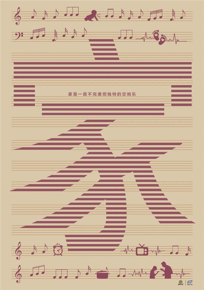
作品题目: 《家的乐章》
创意说明:将家庭中各种声音,如孩子的哭笑声、炒菜声、电视声、争吵声像乐谱一样并置排列,画面中心是“家”,借此表达家是一首不完美但独特的交响乐这一主题。
作者简介: 秦晓楠(上海)
上海出版印刷高等专科学校教师/全国技术能手
南京艺术学院/设计学院/环艺设计硕士毕业
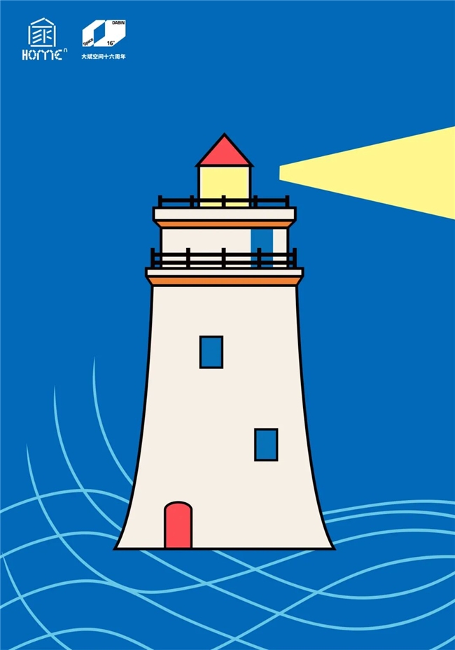
作品题目: 《灯塔》
创意说明: 家就像灯塔一样,永远都留一盏灯给回家的人。
作者简介: 楊捷扉(中国台湾)
留法创意总监与设计顾问,致力于以独特的视觉语言与策略思维,协助品牌在竞争中脱颖而出。她专注于结合设计技术、商业策略与心理学,将创意转化为能实际解决问题的力量。作品曾于全球超过44个国家获得190余项国际设计奖项,并于世界各地展出;亦被全球逾三十间博物馆典藏。她亦受邀担任国际设计竞赛评审,并以客座講師身份替波兰、德国、印尼、中国与巴基斯坦等大学讲授设计课程。
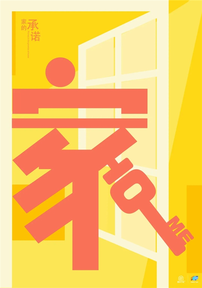
作品题目: 《家的承诺》
创意说明:“家的本质是钥匙的承诺——永远为你留存。(罗尔斯《正义论》)”,诠释家的承诺与归属,正如“此心安处是吾乡”,家是心灵的栖息所,是那份永远为你留存的温暖承诺。海报以“家的承诺”为主题,将“家”字与钥匙图形创意融合,色彩上采用暖黄与暖红搭配,营造温馨感;画面中的门元素,寓意回家。
作者简介: 吕鑫(苏州)
苏州平面设计师协会会员、苏州大学艺术学院视觉设计中心设计师、苏州大成美集有限公司设计师。
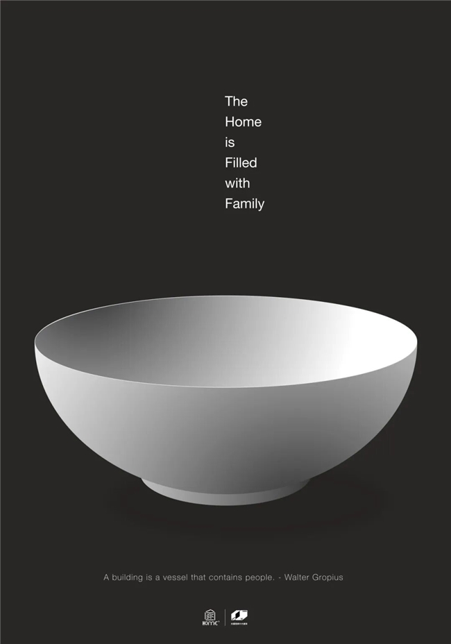
作品题目: 《The Home is Filled with Family》
创意说明: A building is a vessel that contains people- Walter Gropius
作者简介: Kye-soo Myung(South Korea)
-Professor Emeritus,-Serves as a respected juror for various international design organizations and prestigious international design competitions.
作品题目:《Home》
创意说明:Home in this work is not a physical place, but a fading memory suspended between presence and absence. The fragmented forms and letters drift across layers of space, reconstructing the idea of home as a state of mind rather than a location.
作者简介: Emran Abtahi(Iran)
Emran Abtahi is a graphic designer living in Gorgan, Iran. As an independent designer. Since 2018, Emran has specialized in designing social, cultural and political posters and has examined the poster from an artistic point of view. In 2020, he won the first prize Russian Strelka Biennial. Since 2022, he has collaborated with Keith Kitz, a professor at Suffolk University in Boston, on poster design.
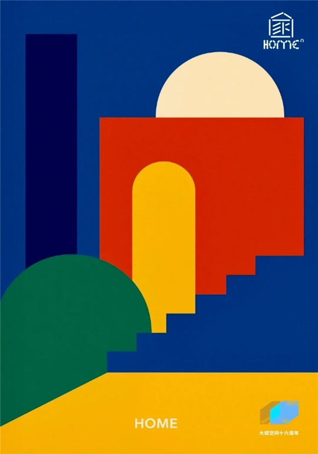
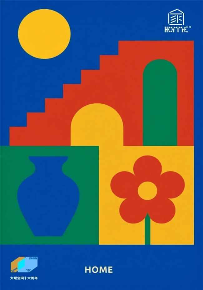
作品题目:《Home - Architectural Harmony; Cultural Harmony 》
创意说明:My poster, “Home-Architectural Harmony”, explores the theme of Home through pure architectural abstraction, where form and color define space without realism. Bold, unmixed hues - red, yellow, blue, and green - create a dialogue between geometric volumes: an archway, a dome, a staircase, and open space. Each element stands independently yet connects seamlessly, symbolizing the balance between structure and openness found in architectural design. The composition embodies clarity and rhythm, suggesting that Home is not just built space, but a harmony between geometry, color, and the human sense of belonging
作者简介: DR. MAHIMA GUPTA (American)
is a Guinness World Record Holder, freelance artist, Teacher and a curator. She has a Ph.D. in Drawing & Painting from University of Rajasthan. Jaipur, India. She received University Grants Commission full Fellowship to pursue PHD. Dr. Mahima is a University Topper and Gold Medalist, 1st position in M.A. (Drawing & Painting). Dr. Mahima works in all mediums. Her works were invited to be exhibited in Europe, North America, South America, Australia, the Middle East and Southeast Asia. She has participated in exhibitions in more than 50 countries. Mahima has been a Jury/Judge at many international art exhibitions in Bangladesh, Azerbaijan, Argentina, Australia, Ecuador, Cuba, Peru & India. She has curated and organized many international art exhibitions. She has received many awards from National and International art exhibitions. Her artworks & articles have been published in many international art magazines, journals, books and book covers.
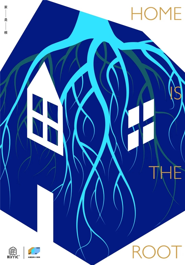
作品题目: 《家是根》
创意说明:意象的“家”汉字演变为根。家就像一棵大树的根,深深扎入泥土,为树叶提供养分与力量。无论树叶飘向何方,根始终在那里,默默守护着它的归途。正如家是我们忙碌后栖息的港湾,家我们游子回归的彼岸,家是我们力量的源泉、家是我们无法忘记的根。
作者简介: 宋学军(安徽)
设 视觉设计师/DRAWTIFY联合创始人/设计总监
作品先后在国内外入展百余次,部分作品获奖或被收藏
在近30个国家及地区展览,IPBP2019南京国际和平海报双年展铜奖、第五届亚洲平面设计双年展评审奖、第七届国际雷鬼音乐海报大赛、第十届纽约联合设计双年展、中美协首届全国平面设计展、乌克兰COW设计双年展、第五届卢布林海报双年展、莫斯科金蜜蜂全球平面设计大展、Madrid Grafica海报展、秘鲁设计双年展等
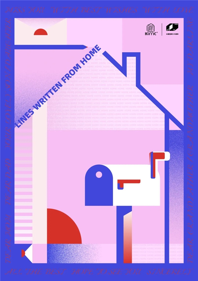
作品题目: 《家书·LINES WRITTEN FROM HOME》
创意说明: 海报以“家书”为主题,画面主体用抽象几何图形构筑起“家”与“信箱”的轮廓,隐喻跨越距离的思念。
“信封”“铅笔”“太阳”等元素,点明家书如暖阳。“LINES WRITTEN FROM HOME”以倾斜构图贯穿画面,形成动态的视觉引导,传递出来自家的深切牵挂。
作者简介: 唐一娇(上海)
中国航海博物馆工艺美术师、劳模创新工作室成员
作品曾获《中国创意设计年鉴》金奖、中国包装联合会中国包装创意设计大赛二等奖、三等奖;海报入选丝绸文化国际海报设计展、成语之都全国百名设计师邀请展、韩国昌原国立大学当代设计网络艺术国际邀请展,并入刊《经略·数字海洋主题海报展特邀作品集》《海洋哺乳动物保护创意设计邀请展作品集》等。
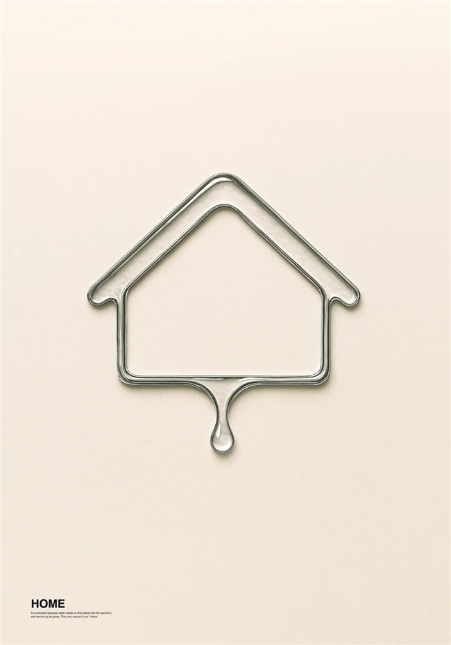
作品题目: 《HOME》
创意说明:I decided to envision “Home” not from a human perspective, but from the viewpoint of communicating life. From there, I conceived that being the source of all things is precisely what constitutes “Home.” If so, it is precisely because water exists on a planet that life was born, and benefiting from that, we (life) exist. I perceive this very source as “Home.” Thus, I designed something like a pictogram of a house shape expressed in water.
作者简介: Takashi Matsuda(Japan)
I started my activities while still a student at the University of Fine Arts. Currently, I host a creative studio that enriches society with communication design, mainly visual identity and branding.
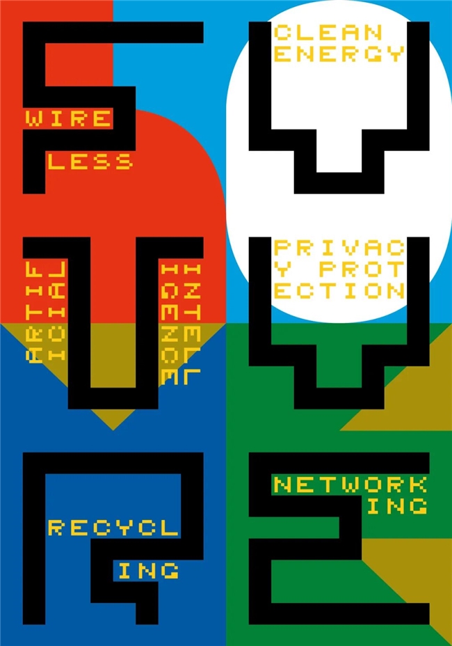
作品题目: 《Future home》
创意说明:A contemporary and modern home should combine certain features related to environmental protection and the digital/information society. Only then will it provide synergy for the modern user. I tried to emphasize this fact in my typographic poster. I used exclusively my own typographic symbols. They contrast with each other. The background is an aesthetically geometric "home." The foreground features a technical and pixelated "future" and desirable features.
作者简介: Jakub Balicki(Poland)
A printed (static) poster for adults and teenagers relating to the future home as a place to live.
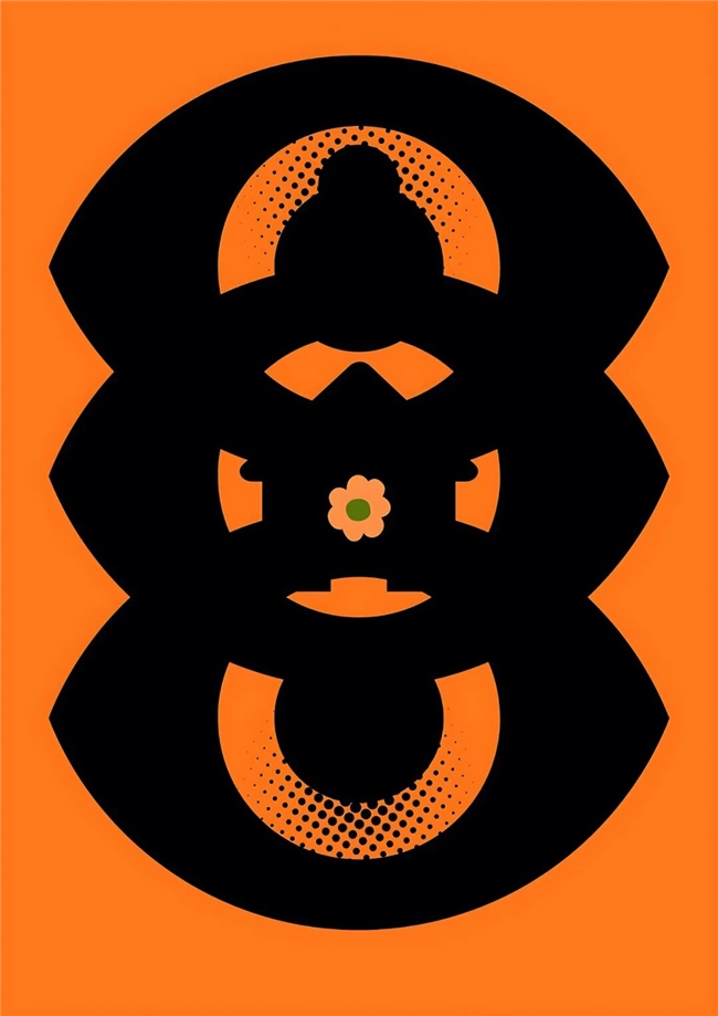
作品题目: 《Nest of Life》《Beyond the Walls》
创意说明:"Nest of Life " the poster masterfully weaves together potent symbols – the eye (vigilance, insight), house (sanctuary, family), entwined heads (unity, partnership), and flower (growth, harmony) – against a vibrant orange and black backdrop. This visual narrative distills the essence of home as a haven of nurturing relationships, protection, and growth, where individuals find solace and flourish together.
"Beyond the Walls" captures home's essence beyond physical boundaries, encompassing emotions, memories, and belonging. Home is where heart finds solace, love and laughter echo, and every corner holds a story. A sanctuary of dreams, peace, and shared experiences.
作者简介: Dr. Dhaneshwar Shah(India)
Dhaneshwar Shah is a multidisciplinary artist born in New Delhi, India, and currently serves as a lecturer at Wuhan University of Technology. He holds a Doctoral degree from the School of Art and Design at Wuhan University of Technology, China, and completed three years of research in inter-media art at the China Academy of Art in Hangzhou, China. Shah earned his Master and Bachelor of Fine Arts degrees from the College of Art in New Delhi, India. With over 15 years of experience in art and design, he specializes in media art, installation art, and graphic art. He has published numerous academic papers in prestigious journals. His art and design works have been exhibited in various countries, including Denmark, Russia, Italy, Singapore, China, and Japan. Shah's unique and thought-provoking artistic vision has been showcased at prestigious events, including the Geumgang Nature Art Biennale in Korea and the International Graphic Triennial Bitola.
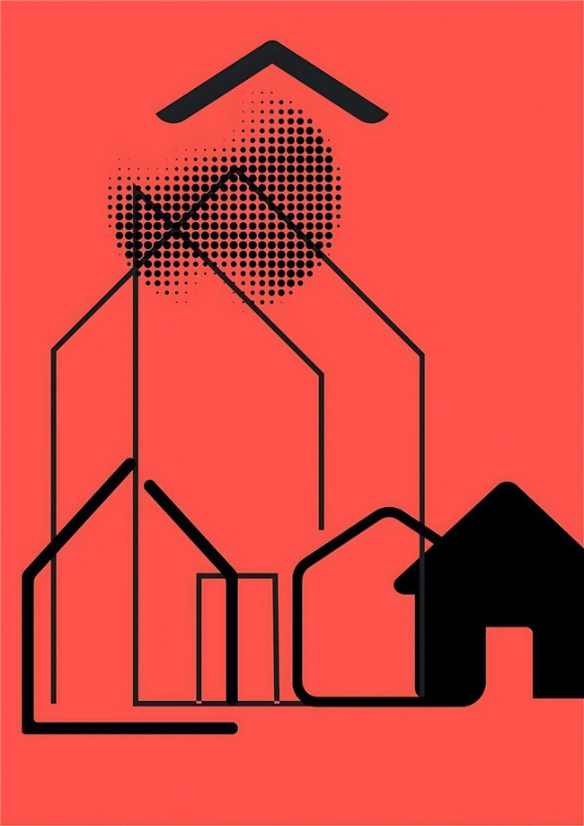
作品题目: 《Home – Shaped of Control》
创意说明:This project explores the relationship between domestic space and the invisible structures of control that shape our sense of safety, belonging, and limitation. The image of a “home” is reduced to its most basic geometric forms — lines, angles, and enclosures — gradually transforming from a symbol of shelter into one of confinement.
Through minimal visual language, Home: Shapes of Control examines how architecture and routine create both comfort and restriction. Each transformation of the house shape reflects a subtle shift in power, boundaries, and emotional distance. The series invites viewers to question where the line lies between protection and possession — between structure and control.
作者简介: Lula Sarnia(Poland)
Lula Sarnia is engaged in both analog and digital art. She studied painting at the Eugeniusz Geppert Academy of Art and Design in Wrocław. Sarnia explores structures of subtle tensions, shifting perspectives on space and the world.Her practice unfolds between material traces and immaterial structures. Her works often arise from close attention to matter. Color, especially her recurring use of deep blues and blacks, serves as both a space of immersion and a symbolic threshold: cool, otherworldly, sometimes bordering on the inhuman. Her work has been featured in collective exhibitions across Argentina, Brazil, China, South Korea, Poland, Slovakia, Taiwan, and the United Kingdom.Sarnia also writes poetry. She is the winner of the main prize in the 27th edition of the Jacek Bierezin Poetry Competition, as a result of which her poetry book "Wiśni mi się" was published.
作品题目: 《家,无需面具》
创意说明:家,无需面具伪装。在这里可以卸下所有头衔、伪装、防备、欢笑、眼泪、疲惫或不堪……愿你,被全盘接纳。家,才是保护区。
作者简介: 李姚(贵州)
主办单位
大斌空间设计事务所
苏州新光天地
学术支持
苏州市软装行业协会
苏州市设计师协会
苏州平面设计师协会
承办单位
字魔营(中国文化设计创作阵营)
“家的N次方“国际海报展组委会
2025年10月30日
主办单位
大斌空间设计事务所
苏州新光天地
学术支持
苏州市软装行业协会
苏州市设计师协会
苏州平面设计师协会
承办单位
字魔营(中国文化设计创作阵营)
“家的N次方“国际海报展组委会
2025年10月27日